

Boll & Branch
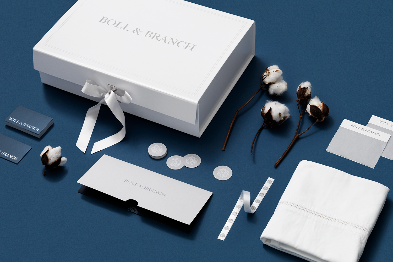
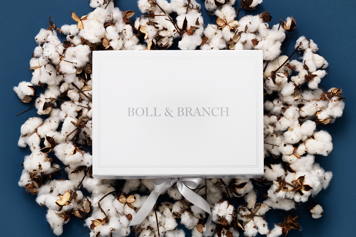
Branding, packaging, print collateral, marketing design, and art direction for Boll & Branch, a luxury bedding company.
Utilizing a traditional serif, the primary Boll & Branch logomark is modernized with unique ligatures and breaks along with a custom ampersand. In addition to the primary logo, the secondary mark harkens back to an original element of the Boll & Branch identity; meant to represent the seed of life, simplified elements and rounded edges help to tie the mark back to logo.
A neutral color palette complements the Boll & Branch product assortment, with various grays to create depth in the brand experience and a strong navy hue to ground assets.
Branding and art direction come together in the digital experience—the soft palette and updated, elevated photography are the focus of the website. With an updated photography style that focuses on highlighting the product, images are shot in a streamlined, consistent manner with a touch of personality in dynamic layering and folds.
︎︎︎ Creative Director: Jess Williams
︎︎︎ Art Director: Rebecca Sloat
︎︎︎ Designers: Rebecca Sloat, Mary Rabun
︎︎︎ Photographer: Gregory Reid
︎︎︎ Stylists: Margaret Ward, Paulie Fey
︎ Created at Communal Creative
︎︎︎ Art Director: Rebecca Sloat
︎︎︎ Designers: Rebecca Sloat, Mary Rabun
︎︎︎ Photographer: Gregory Reid
︎︎︎ Stylists: Margaret Ward, Paulie Fey
︎ Created at Communal Creative