


Juniper Square
Branding and site design for a real estate software company, Juniper Square.
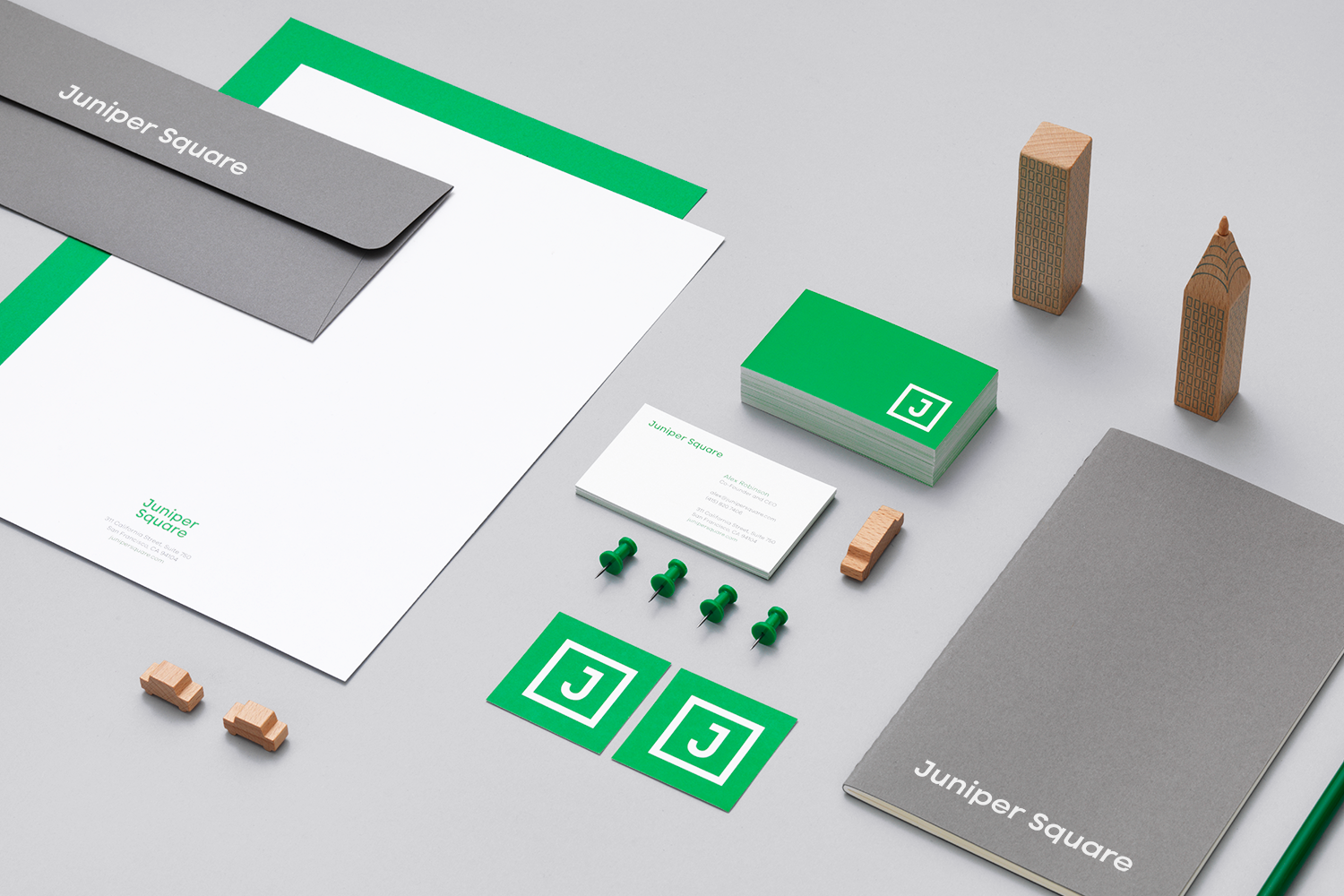
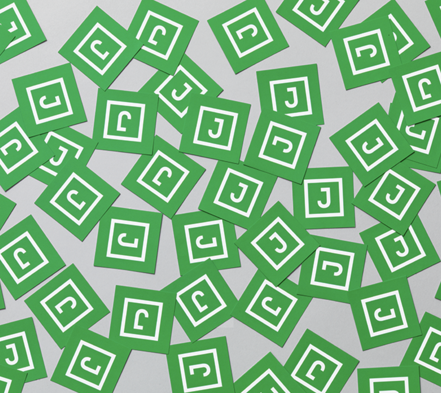
The primary wordmark is a streamlined sans-serif, evoking the modern, clean experience that Juniper Square offers its customers. The secondary mark takes the stylized J from the primary logo and uses a literal square to represent Juniper Square in a stamp-like format. With a bright primary hue, Juniper Square stands out from market competitors; grays help to ground the vibrant green.
The Juniper Square online experience champions the software's ease. Through bold typography and branded illustrations, the site is a dynamic and modern contrast to many competitors in the space.
︎︎︎ Creative Director: Jess Williams
︎︎︎ Art Director: Rebecca Sloat
︎︎︎ Designers: Rebecca Sloat, Mary Rabun
︎ Created at Communal Creative
︎︎︎ Art Director: Rebecca Sloat
︎︎︎ Designers: Rebecca Sloat, Mary Rabun
︎ Created at Communal Creative