I worked with andhale to create their brand from the ground up.
On a mission to make purpose-driven habits a core part of self-care, andhale is expanding mindfulness toolkits with their gem-oils. Starting out with a different name, the first part of the project was foundational brand strategy — which led us down the path of naming.
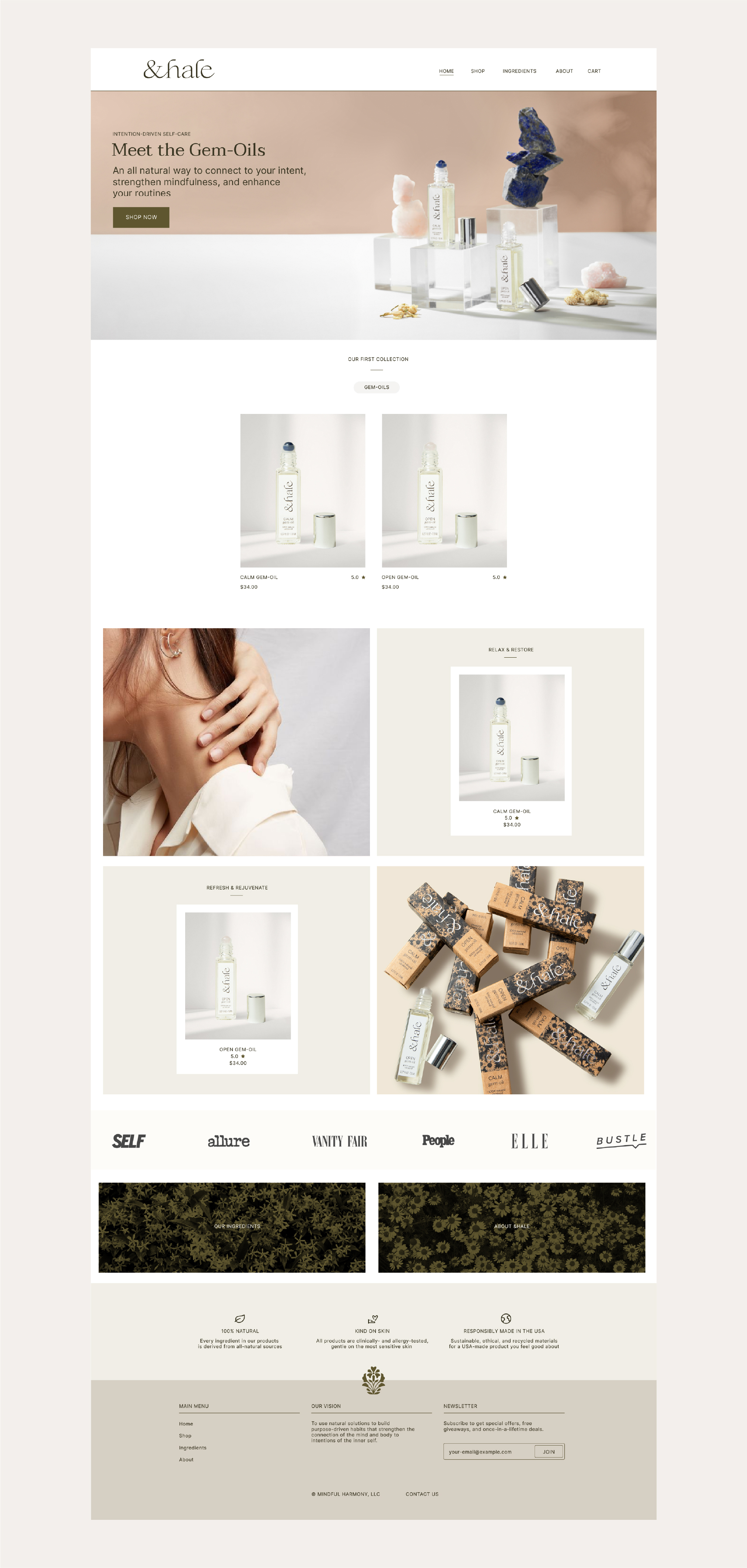
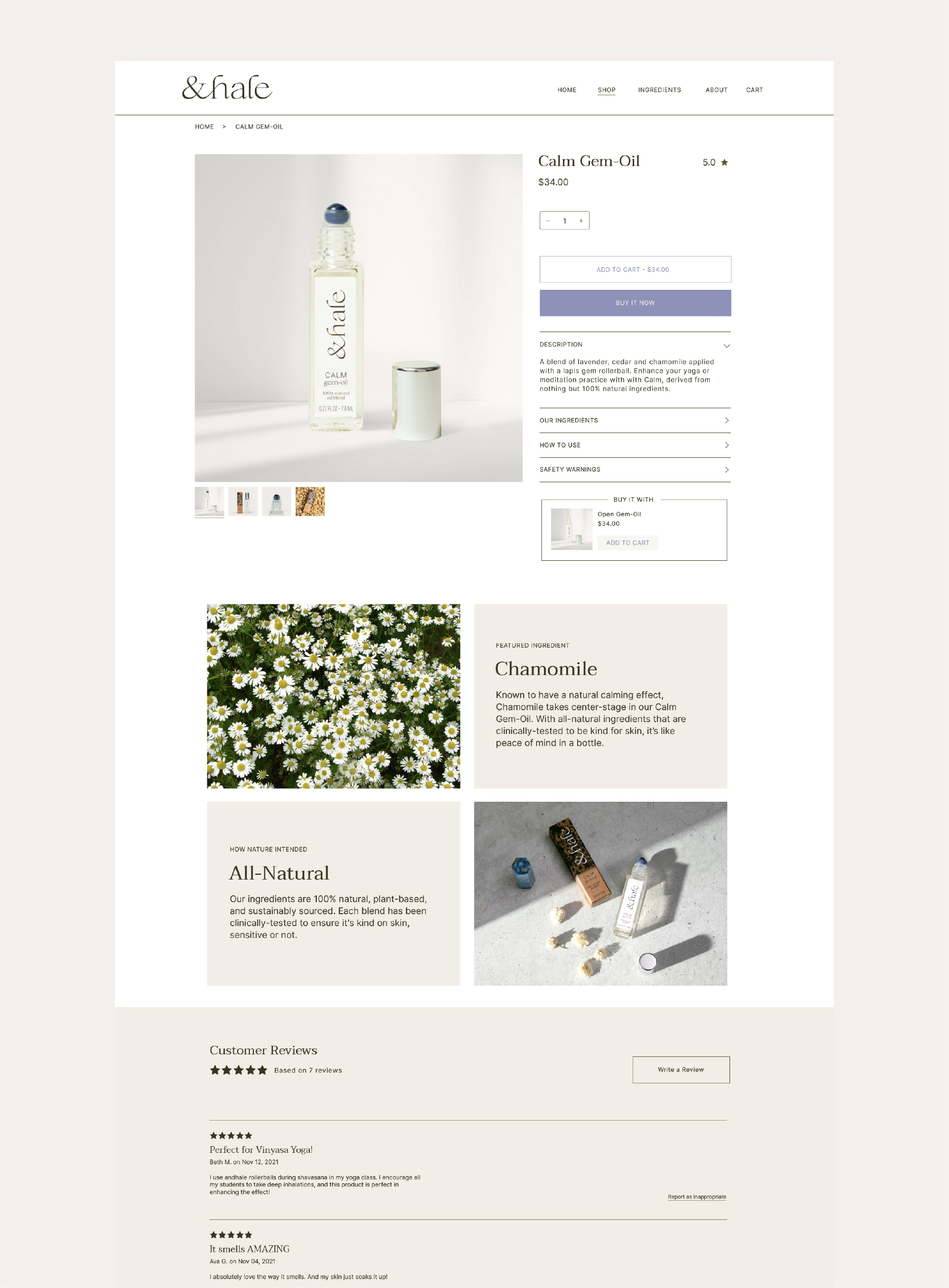
With a new name and core tenets identified, we set out to create a holistic visual identity for the brand. An earthy, elevated color palette, natural materials, and a mix of feminine and masculine typography create a premium look and feel for the brand without being unapproachable. The identity was built out for various platforms: physical, with print and packaging materials, as well as digital, with their D2C website and social media platforms.
With a new name and core tenets identified, we set out to create a holistic visual identity for the brand. An earthy, elevated color palette, natural materials, and a mix of feminine and masculine typography create a premium look and feel for the brand without being unapproachable. The identity was built out for various platforms: physical, with print and packaging materials, as well as digital, with their D2C website and social media platforms.
PROJECT SCOPE
→ Brand Naming
→ Brand Strategy
→ Brand Identity
→ Packaging System
→ Packaging Production
→ Photo Art Direction
→ On-Set Styling + Post-Production
→ Web Design
→ Social Assets
→ Launch
→ Brand Naming
→ Brand Strategy
→ Brand Identity
→ Packaging System
→ Packaging Production
→ Photo Art Direction
→ On-Set Styling + Post-Production
→ Web Design
→ Social Assets
→ Launch

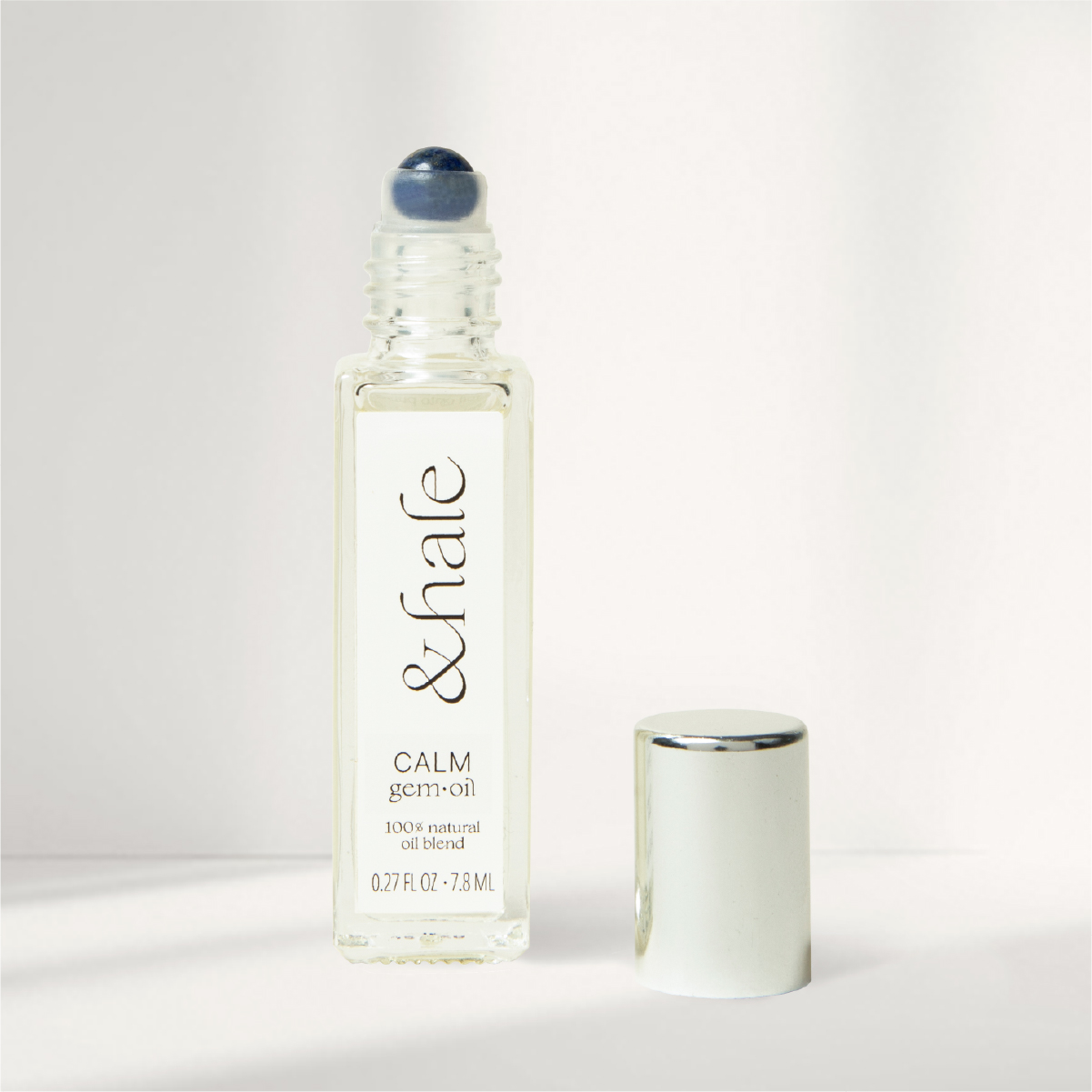
Brand Naming & Logo Design
Starting out as Mindful Harmony, the brand name was among the first items to address. We knew had hurdles out of the gate with the name: Competitors frequently used the words ‘mindful’ and ‘harmony’ as descriptors for their product (or, in one case, as the name of one of their oil blends). Beyond that, we already knew the product format — an 8ml rollerball — and a petite primary display panel on packaging would only highlight the difficulty of a long name.
Working in tandem with a strategist, a new brand name was created. Playing off the idea of rituals and breathwork, the name andhale was the perfect fit — a more abstract, unique brand name that enhanced the product benefit, allowed for a larger footprint on-pack, and was broad enough for variety in future product development.

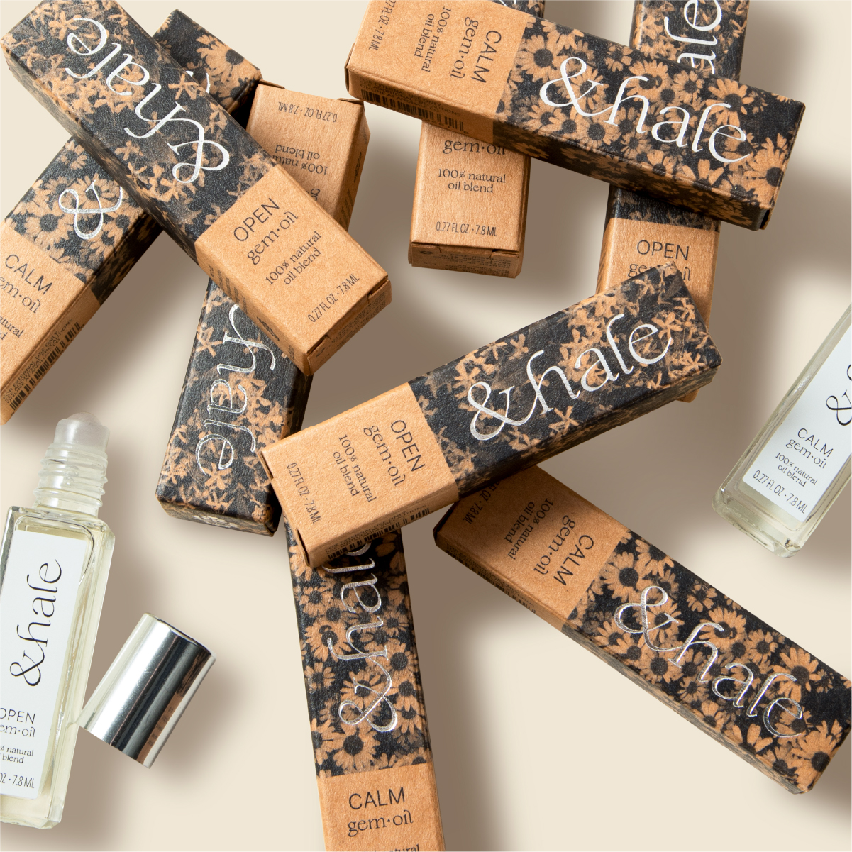
Packaging Design + Production
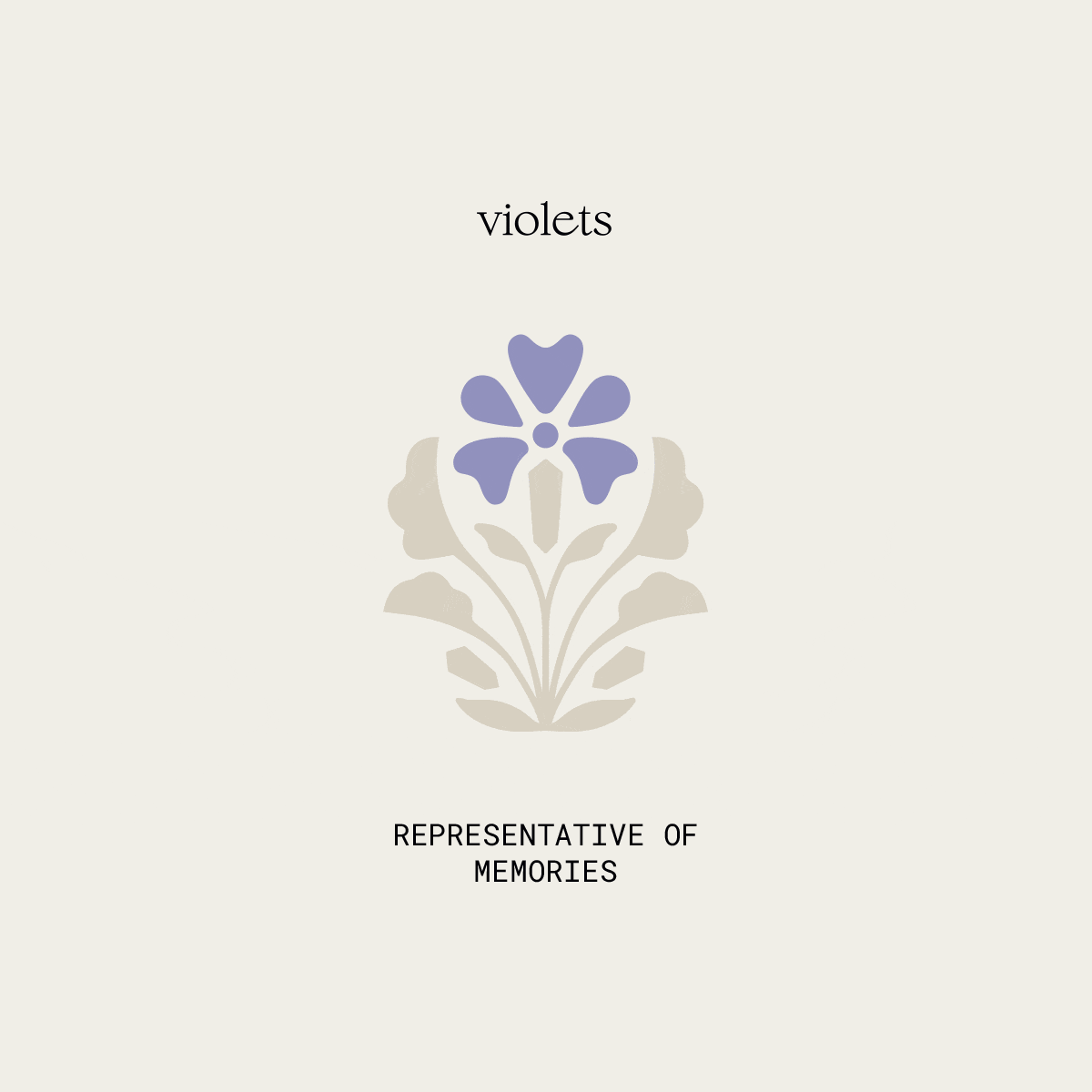
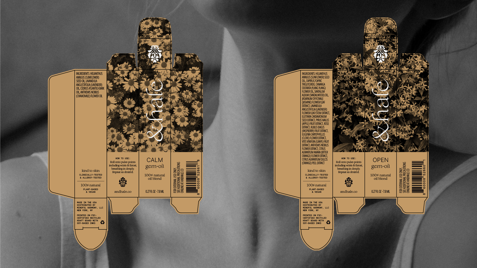
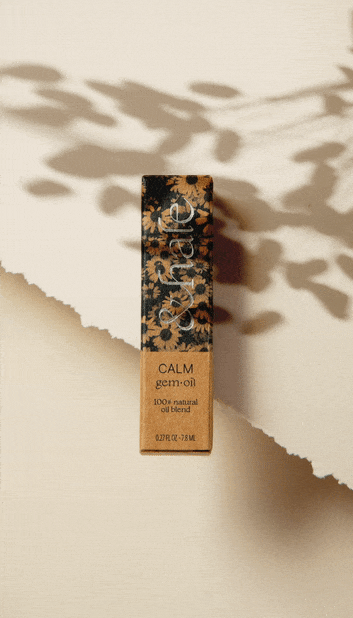
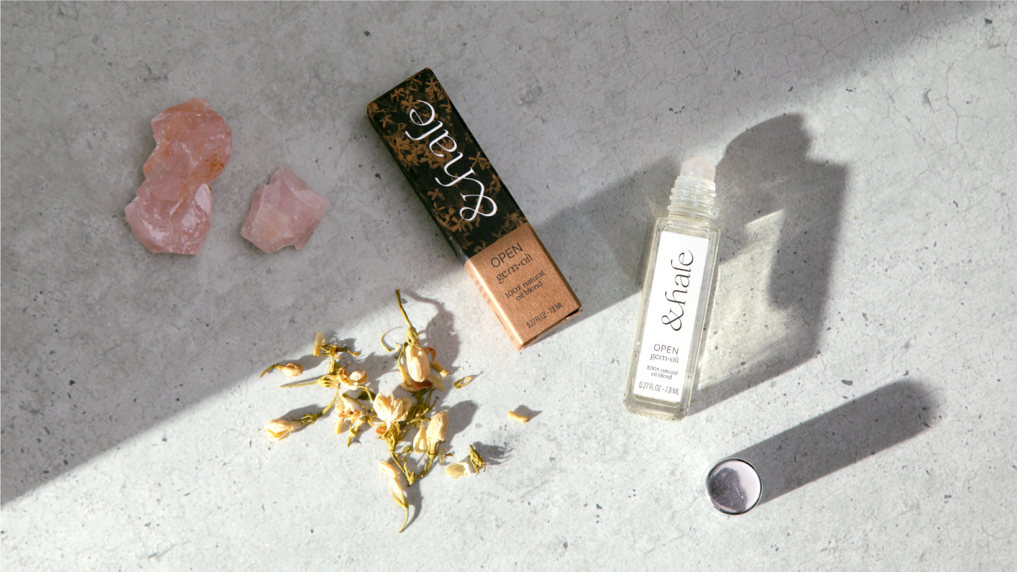
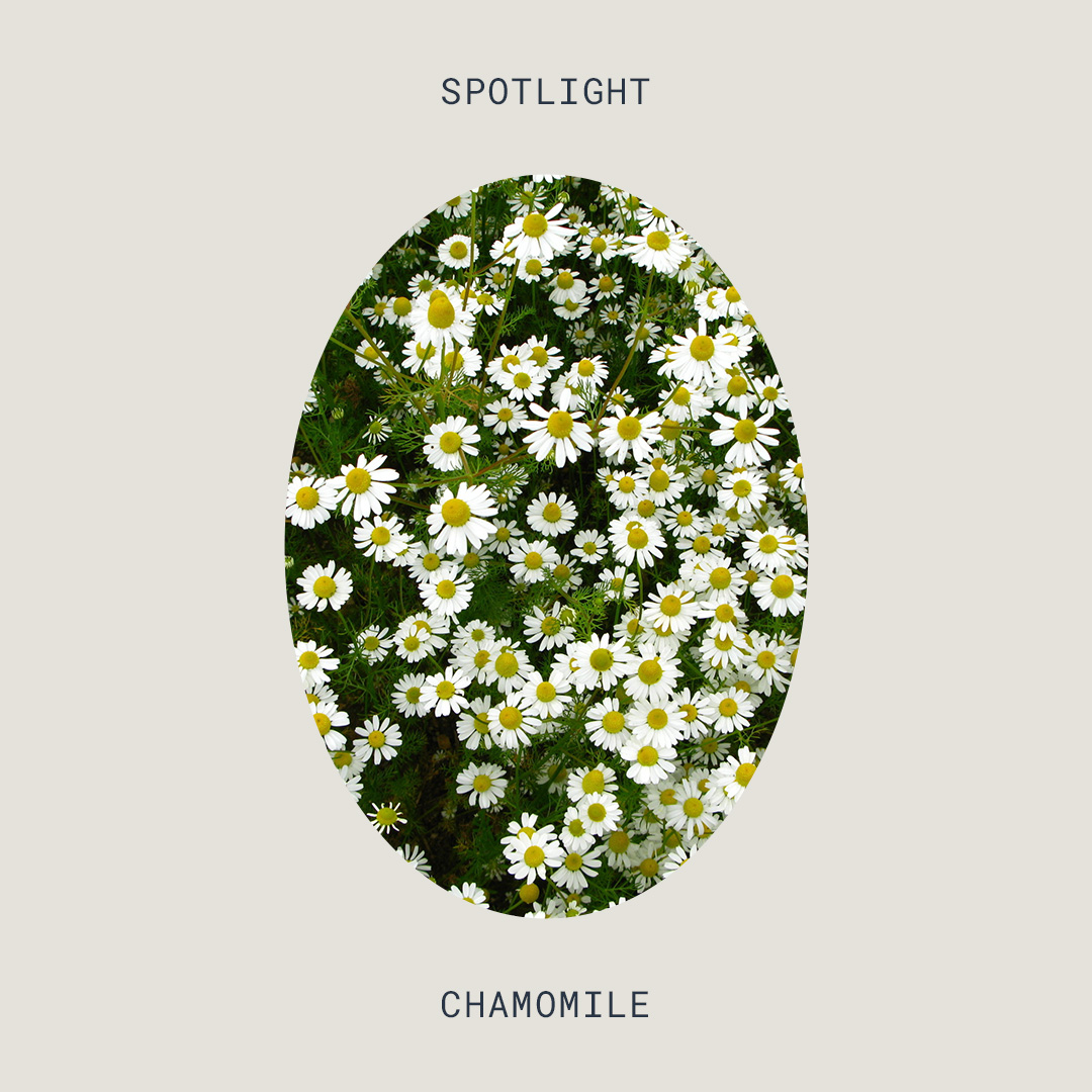
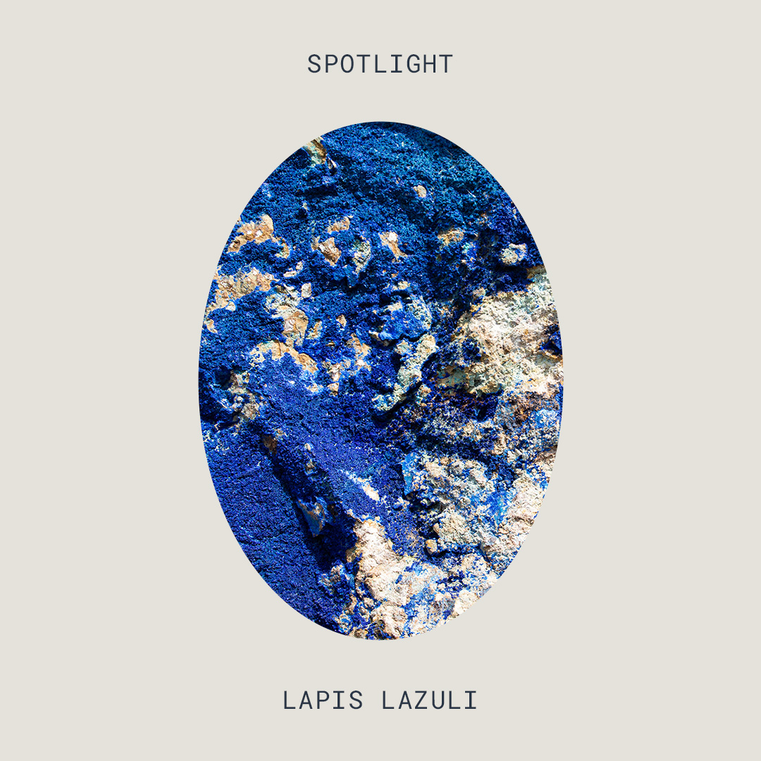
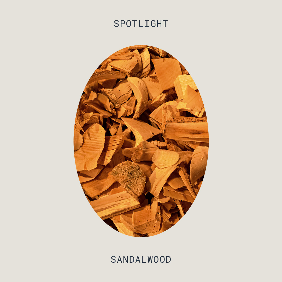
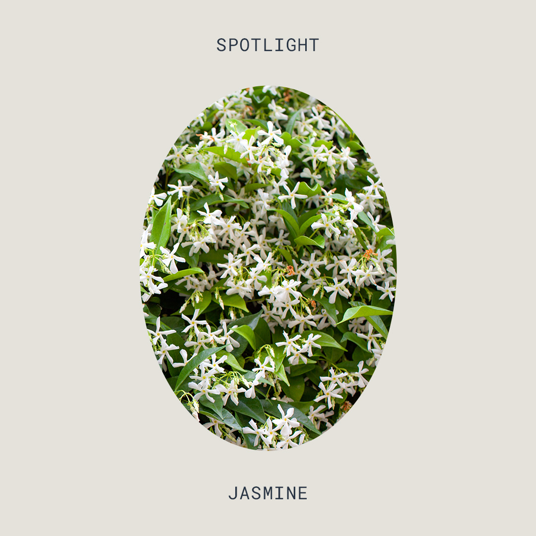
Before engaging in the visual brand identity, the andhale team had already made key material decisions for their product. An earthy, recycled kraft board had been purchased in bulk alongside silver-capped rollerballs (with the company’s signature gemstone applicators). Kraft paper and silver quickly became a consistent factor between the primary and secondary packaging; floral photography printed directly on the recycled board creates depth and visual interest, highlighting a key ingredient in each blend. Silver foil logos connect back to the applicator, and stand out against the black & white print.
Ethical and sustainable practices are a key tenet for the brand, and the packaging is no exception. The FSC-certified board is made from recycled materials, and selections like glass componentry and soy-based inks ensure easy recycling when finished.
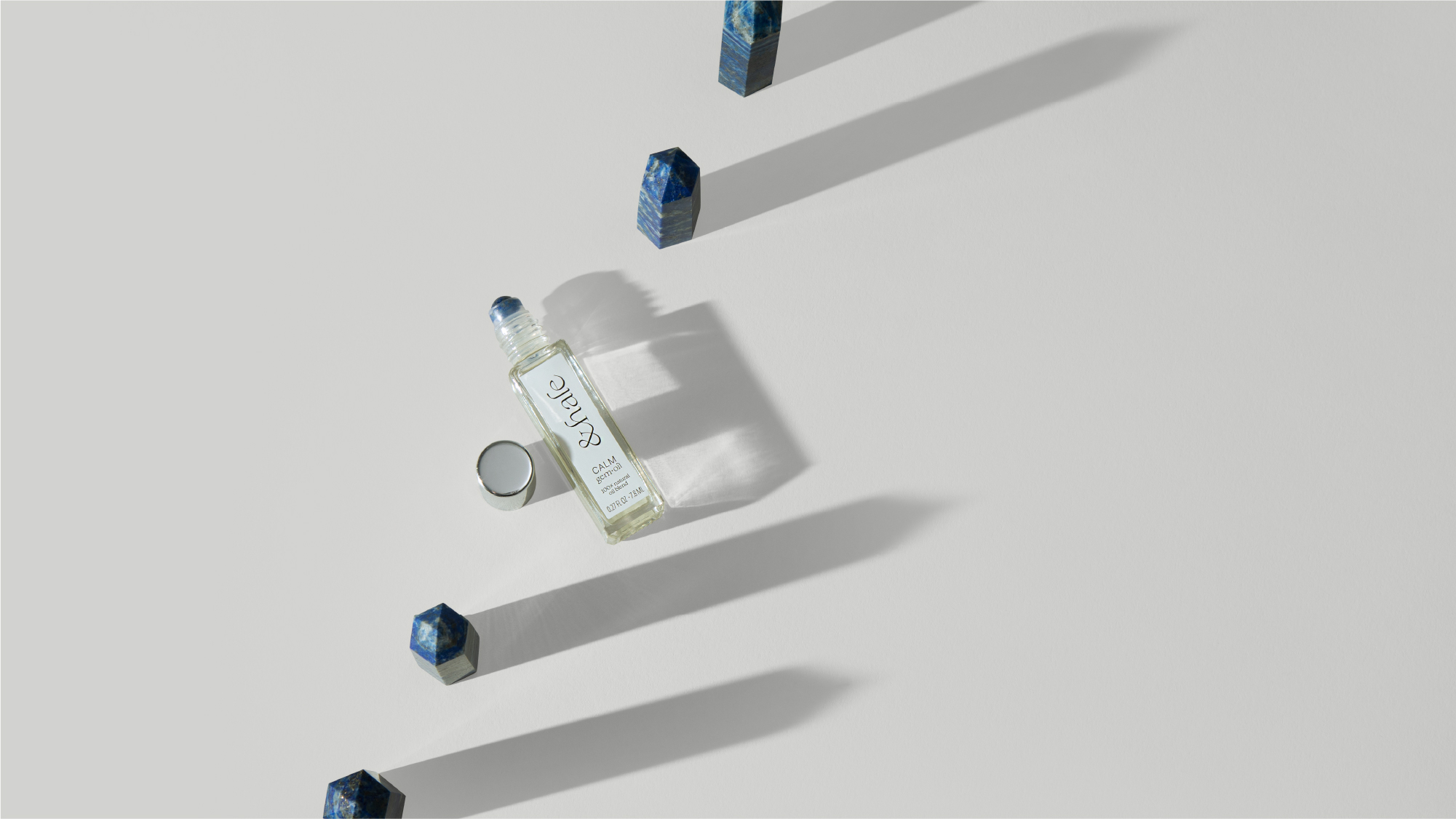
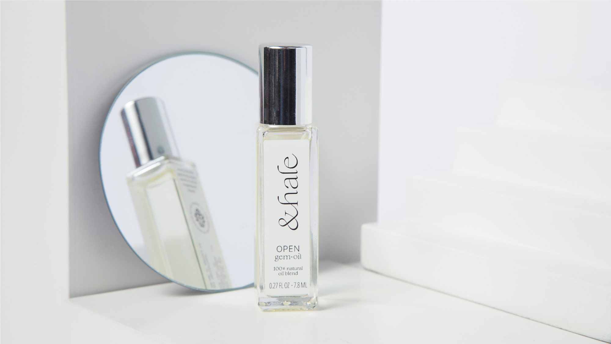
Art Direction
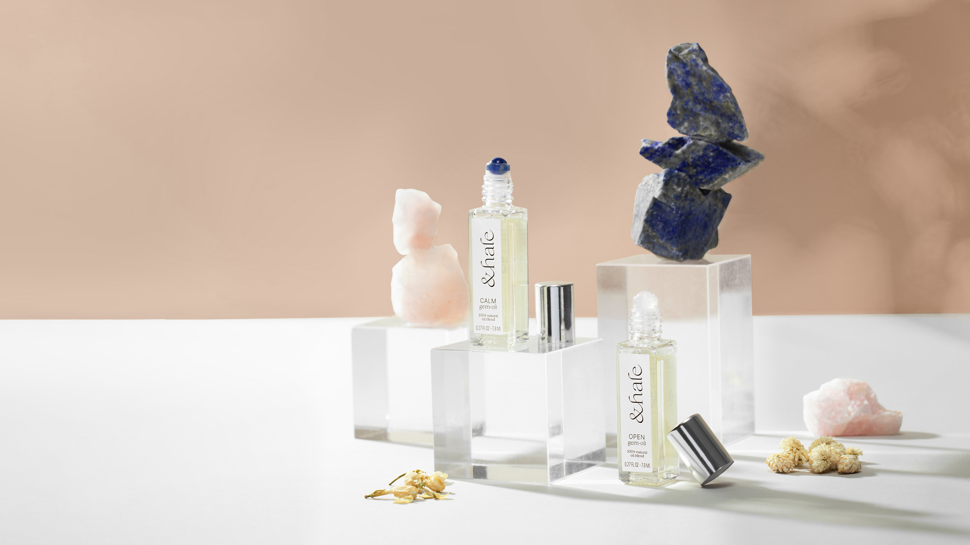
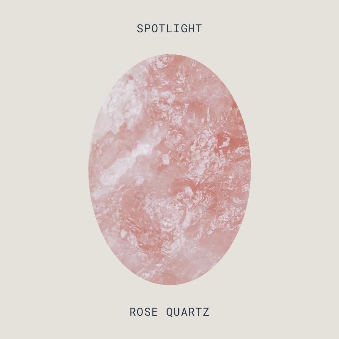
With the visual identity and packaging complete, we set out to bring the brand to life in photography. High-contrast yet soft shadows are found throughout the brand’s assets, including floral elements that echo the product formulations. Earthy colors mimic the palette, with textures brought in for additional visual interest. And the product itself was key — dried flowers and crystals that match each formulation were incorporated, along with elements like clear, acrylic risers and mirrors that speak to clarity and reflection.


Web Design
The website is a culmination of the elements together — brand marks, color palette, type kit, and photography. Built on Shopify, we customized a theme to utilize the brand’s visual toolkit; its streamlined design enhances the assets already created.

Launch Assets
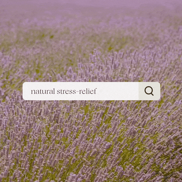
Last but not least, launch. With a direct-to-consumer site and marketing plan, the brand’s launch assets were focused on Instagram. Custom, one-off posts and templates were created to complement static photography captured earlier in the project, creating an engaging, visually varied look for the feed. Stock photo and video assets were heavily utilized in this phase, combined with the brand’s visual style to make them all their own.

︎︎︎ Creative Director + Designer: Rebecca Sloat
︎︎︎ Strategist: Nick McVey
︎ Created at The Ralley
︎︎︎ Strategist: Nick McVey
︎ Created at The Ralley