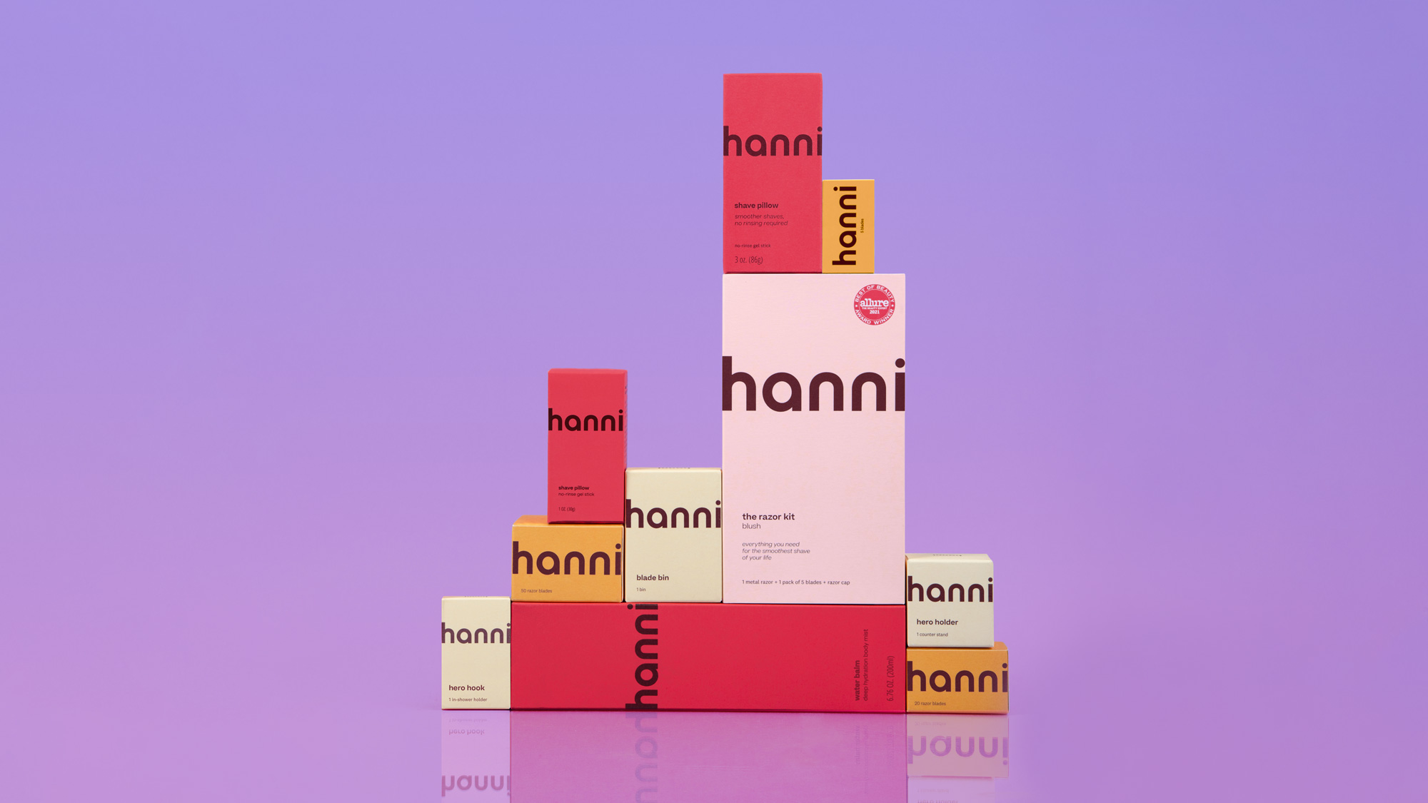
I worked with hanni on a packaging redesign for their Sephora launch.
With an exclusive launch at Sephora on the horizon, I worked with the founding hanni team to revisit their packaging and ensure it was retail-ready.
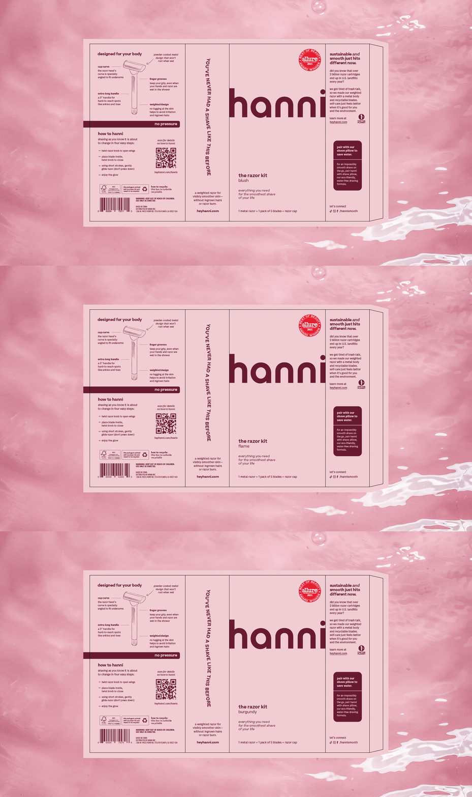
As a D2C brand from launch, the packaging was streamlined and bold, but the system itself lacked education for the consumer and wasn’t FDA compliant — nor did it meet Sephora’s requirements for brands in their store.
With an existing visual toolkit that the team loved, we made impactful revisions to foundational brand elements like typography and color to better serve a brick-and-mortar setting. We adjusted content layout and re-wrote copy to ensure education was at the forefront; a new color-coded system was designed to help navigation on-shelf, and revisions to the design allowed for consistency between vendors as well as through the print process.
PROJECT SCOPE
→ Brand Elements
→ Packaging System
→ Packaging Production
→ Product Design
→ Photo Art Direction
→ Retail Consulting
→ Brand Elements
→ Packaging System
→ Packaging Production
→ Product Design
→ Photo Art Direction
→ Retail Consulting
Packaging System Design
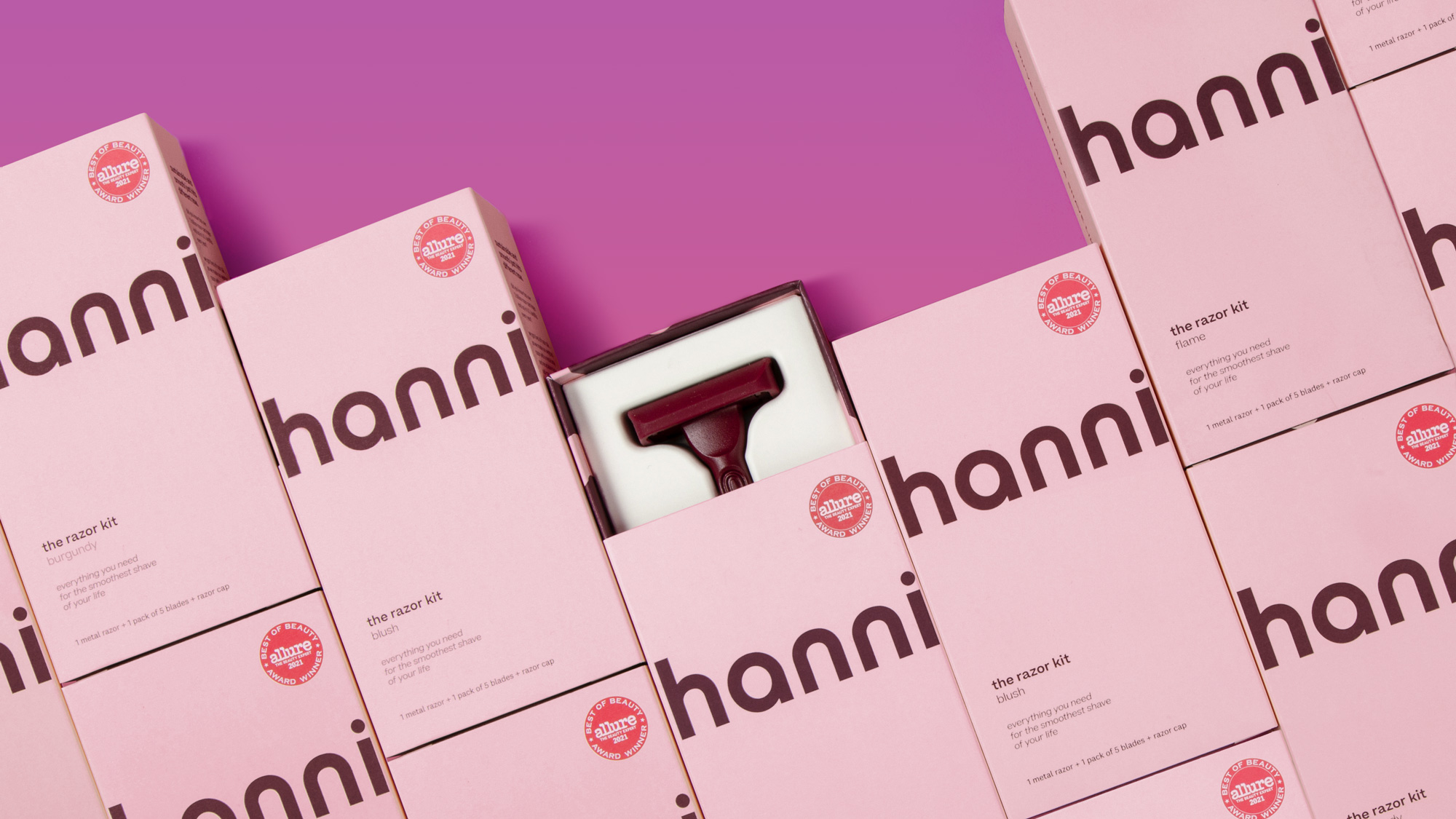
The overall theme was keep the essence of the original packaging, but make smarter decisions based on print production and brick-and-mortar retail. One of the biggest pain points of the packaging was the lack of a system and reason for color usage, making new product launches difficult for the team to create and, ultimately, a confusing consumer experience.
We kept many core elements but ensured they worked harder for the brand. As an example, the hanni team loved the color-blocked design of original D2C packaging — but the colored panels would often bounce in production, ending up visible on the front display panel. A revamp to the design system allowed the color-blocked look and feel to be throughout the line, with razors as blush, body products as coral, and more — not only solving the production issue, but also creating a navigational moment for the consumer.
And, knowing that many consumers’ first interaction with the brand would be in-aisle at Sephora, we took a fresh look at copy and quadrupled what was on-pack while keeping a streamlined look & feel. The result is a system that is bold and striking on-shelf while being compliant with FDA guidelines and Sephora’s brand requirements.


New Product Launches
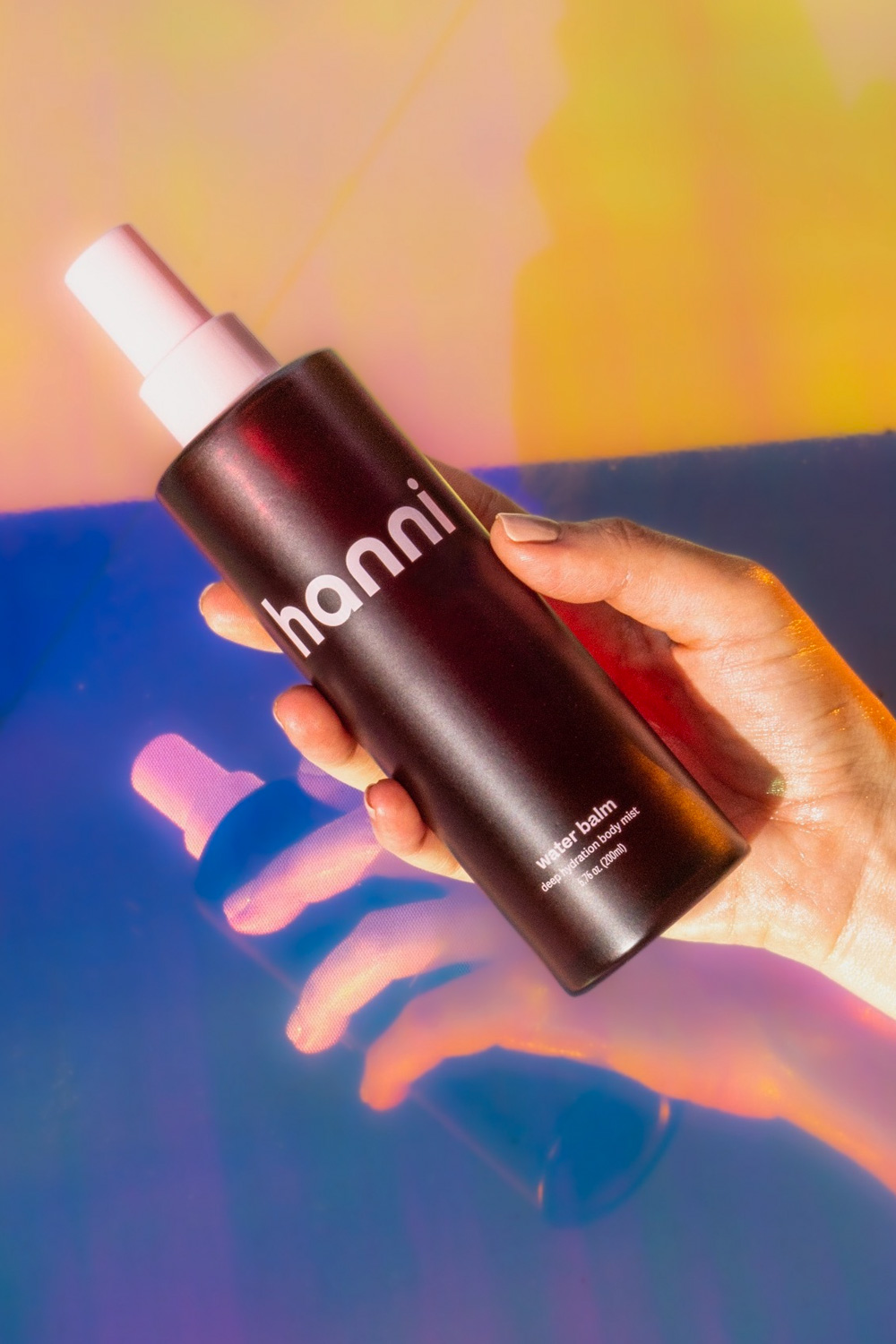
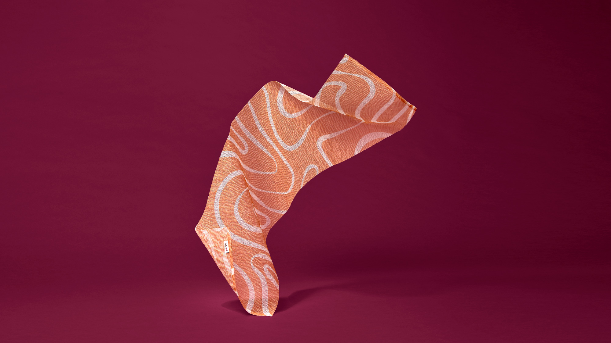
As an ongoing partner, I continue to work on product development and line extensions with the hanni team. Complementary body products to their signature razor have been a large part of their new launches; I’ve worked on everything from primary and secondary packaging design through designing custom print & patterns for new product development — including their first body accessory, the Shower Scarf.

︎︎︎ Creative Director + Designer: Rebecca Sloat
︎ Created at The Ralley
︎ Created at The Ralley